Challenge:
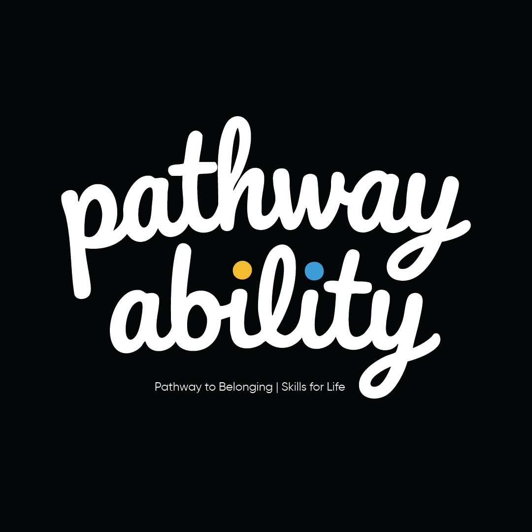
Pathway Ability needed an identity that could capture the warmth and human connection at the heart of their mission. The primary challenge was to create something modern and uplifting that felt personal and empowering, steering clear of the cold, corporate, or clinical styles often seen in the non-profit sector. The logo had to be genuinely cool and approachable—something participants would be proud to wear on their uniforms.
Pathway Ability needed an identity that could capture the warmth and human connection at the heart of their mission. The primary challenge was to create something modern and uplifting that felt personal and empowering, steering clear of the cold, corporate, or clinical styles often seen in the non-profit sector. The logo had to be genuinely cool and approachable—something participants would be proud to wear on their uniforms.
Solution:
The solution is a custom, hand-lettered wordmark that immediately communicates a sense of personality and care. The fluid, connected script visually represents the "pathway," while the friendly lowercase letters create an inclusive and welcoming tone that embodies "belonging." To celebrate the unique individuals within the program, the dots of the 'i's are replaced with the brand's primary colors—a spark of optimistic yellow and a dot of supportive blue. This detail transforms the logo from a simple wordmark into a story of personal growth within a community.
The solution is a custom, hand-lettered wordmark that immediately communicates a sense of personality and care. The fluid, connected script visually represents the "pathway," while the friendly lowercase letters create an inclusive and welcoming tone that embodies "belonging." To celebrate the unique individuals within the program, the dots of the 'i's are replaced with the brand's primary colors—a spark of optimistic yellow and a dot of supportive blue. This detail transforms the logo from a simple wordmark into a story of personal growth within a community.
Outcome:
The final identity is an authentic and memorable brand mark that perfectly captures the spirit of Pathway Ability. It successfully balances professionalism with a deeply human touch, giving the organization a versatile logo that works beautifully on everything from café signage to staff uniforms. The design has been embraced by the community, providing a symbol that participants are proud to be associated with and which emotionally connects with customers and stakeholders.
The final identity is an authentic and memorable brand mark that perfectly captures the spirit of Pathway Ability. It successfully balances professionalism with a deeply human touch, giving the organization a versatile logo that works beautifully on everything from café signage to staff uniforms. The design has been embraced by the community, providing a symbol that participants are proud to be associated with and which emotionally connects with customers and stakeholders.