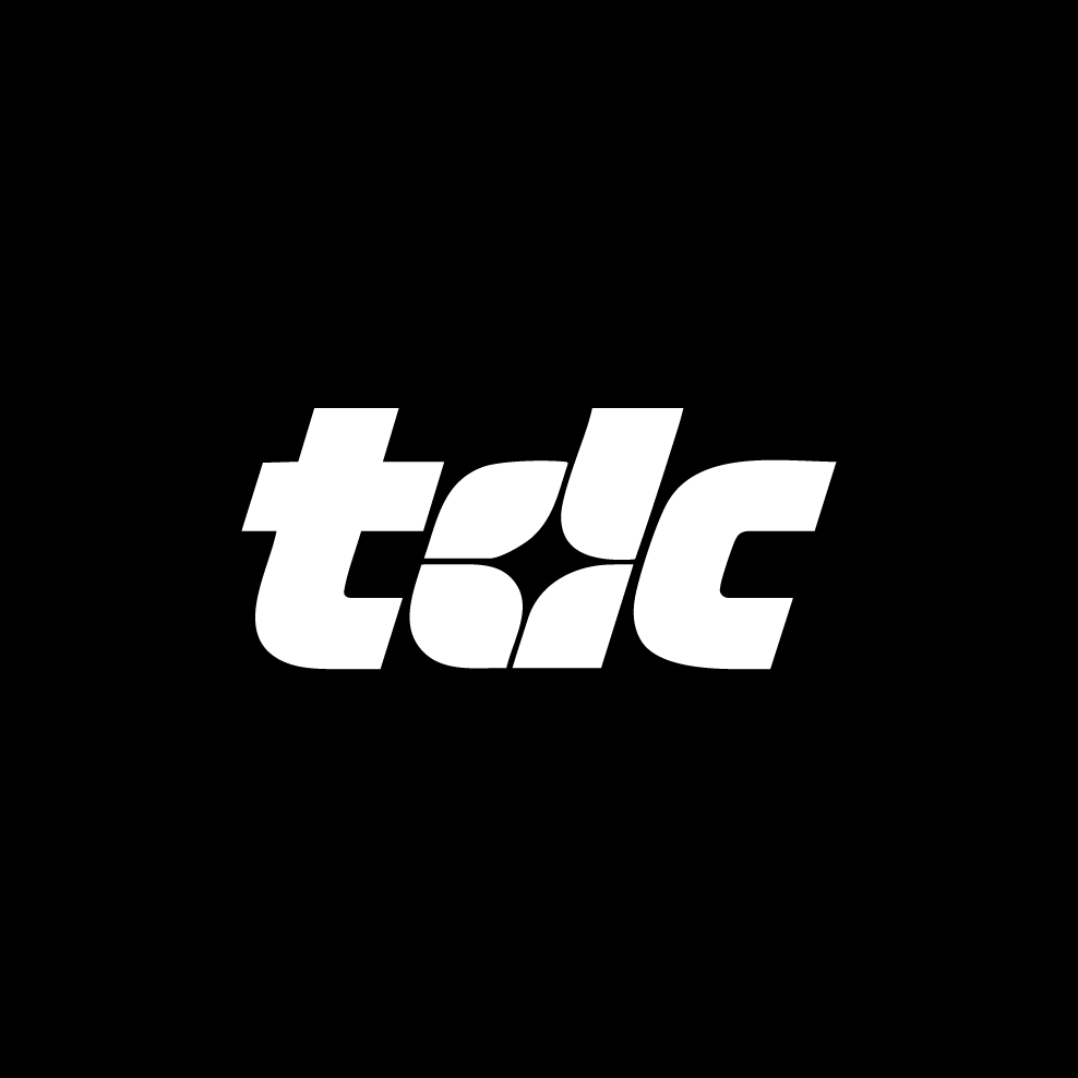
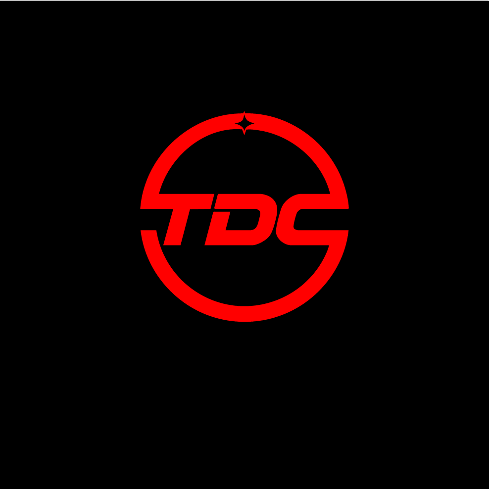
Challenge
TDC, a specialty industrial electrical contractor, needed to reenvision its brand identity. Their existing logo didn't fully capture the high level of expertise and technical precision inherent in their name, "Top Dead Center." The challenge was to design a modern, memorable logo that would communicate core values of accuracy, engineering, and reliability to a sophisticated industrial audience.
Solution
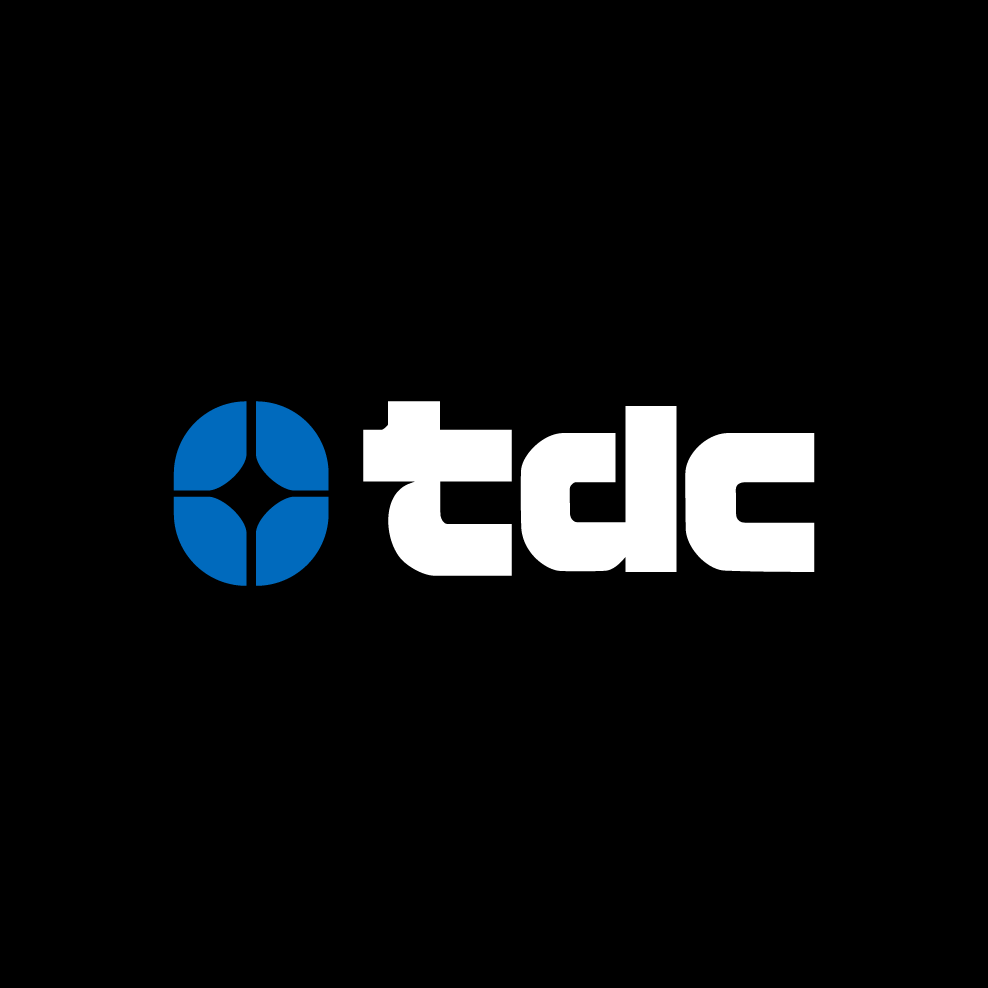
The solution is a cohesive and modern logo system built on the principle of precision. A stylized crosshairs icon was developed as a direct visual metaphor for "Top Dead Center," signifying accuracy and focus. Paired with this is a custom, lowercase typeface with a bold, industrial feel. Crucially, the ink traps within the letterforms were designed to perfectly mirror the negative space of the icon. This intentional detail creates a strong visual harmony, unifying the symbol and the name into a single, memorable mark.
Outcome
The final logo is a powerful and sophisticated identity that successfully positions TDC as a leader in their field. It effectively communicates their core promise of precision and technical excellence in a clean, modern, and professional manner. The new identity is scalable, memorable, and provides TDC with a confident brand foundation that elevates their presence and differentiates them from competitors.
Alternative logos