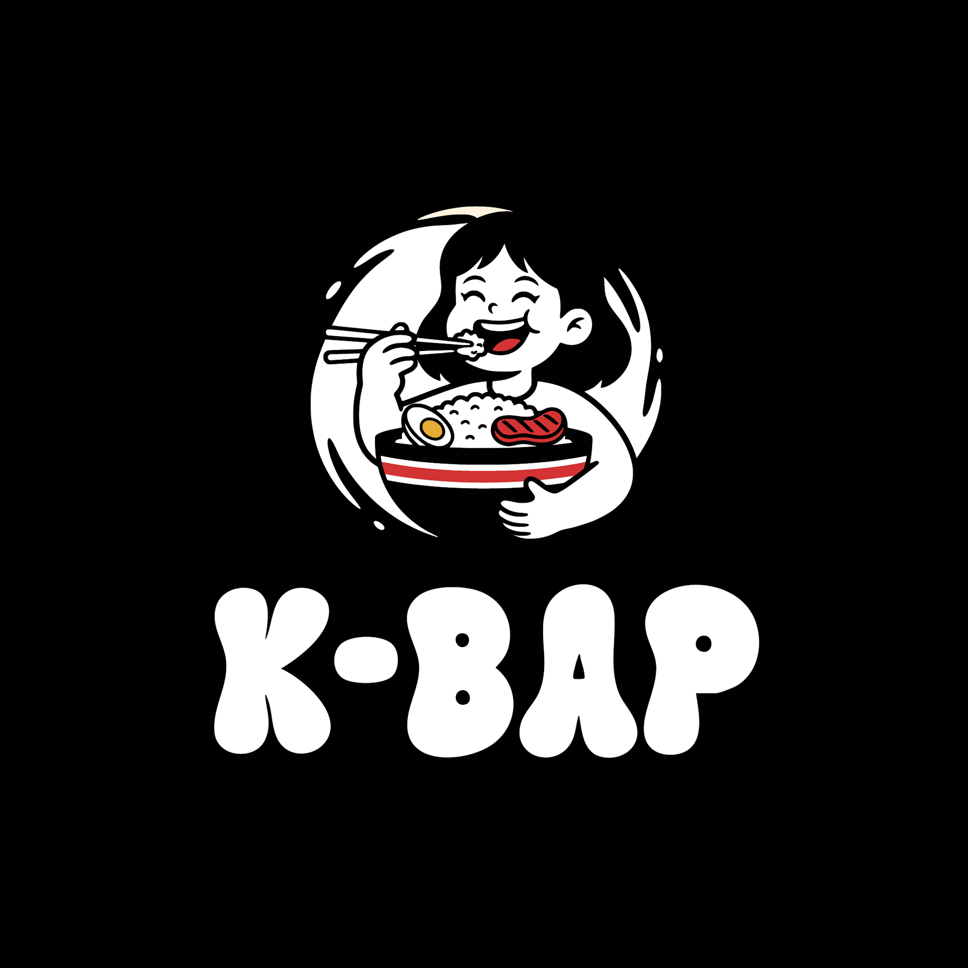
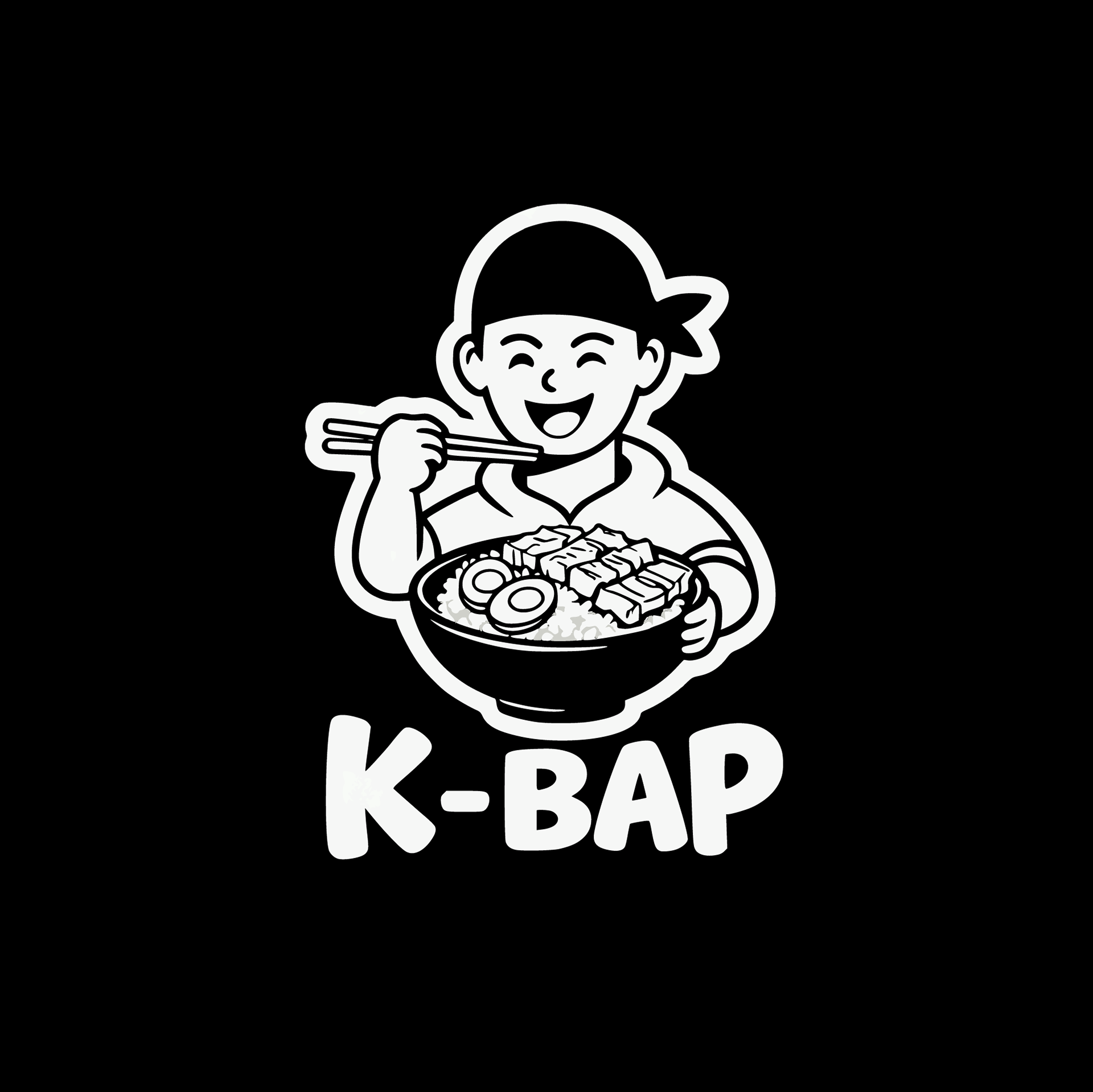
Challenge:
The client, K-BAP, needed a brand new logo for their Korean bowl restaurant. The primary challenge was to create an identity that felt "happy and fun" while clearly communicating their core offering. The logo had to appeal to a diverse community and wide age range, and be versatile enough for use across digital platforms, print materials, and large-scale signage. The client was open to a character-driven concept but required the inclusion of a bowl.
Solution:
To meet the client's vision, we developed a custom mascot logo centered around the joyful experience of eating. The solution was a friendly and energetic character enthusiastically enjoying a K-BAP bowl. The illustration was crafted in a bold, clean line art style, ensuring it was modern, memorable, and highly scalable. We incorporated key ingredients like rice, grilled meat, and a boiled egg to instantly signify the product. The playful, rounded typography was chosen to complement the illustration and reinforce the brand’s fun-loving personality.
Outcome:
The final logo is a vibrant and engaging brand identity that perfectly captures the essence of K-BAP. The cheerful mascot serves as a welcoming face for the brand, creating an immediate emotional connection with customers. The design is not only visually appealing but also strategically effective; its clean and self-contained composition ensures maximum versatility and legibility across all required applications. The result is a strong, unique, and marketable identity that effectively sets K-BAP apart in a competitive food industry.
ALTERNATIVE LOGO