Challenge:
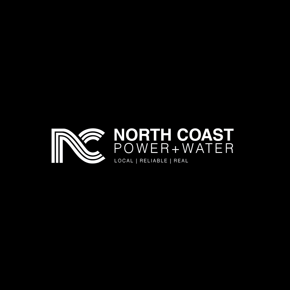
North Coast Power & Water had an existing wordmark but needed a complete, memorable, and versatile brand identity to reflect its dual focus on power and water solutions. The challenge was to create a visual system that captured the essence of "flow" — representing energy, water, and the local coastal landscape — while appealing to a diverse audience of farmers, tradespeople, and homeowners.
North Coast Power & Water had an existing wordmark but needed a complete, memorable, and versatile brand identity to reflect its dual focus on power and water solutions. The challenge was to create a visual system that captured the essence of "flow" — representing energy, water, and the local coastal landscape — while appealing to a diverse audience of farmers, tradespeople, and homeowners.
Solution:
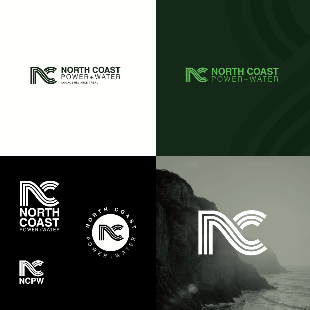
A fluid and sophisticated "NC" monogram was designed, using three parallel lines to create a sense of movement that abstractly represents both waves and electrical currents. This central icon became the foundation of a comprehensive identity system, including horizontal, stacked, and circular logo lockups for maximum flexibility. Paired with a clean, modern typeface and the established color palette, the identity was applied across various mockups to demonstrate its strength and adaptability in both digital and print environments.
A fluid and sophisticated "NC" monogram was designed, using three parallel lines to create a sense of movement that abstractly represents both waves and electrical currents. This central icon became the foundation of a comprehensive identity system, including horizontal, stacked, and circular logo lockups for maximum flexibility. Paired with a clean, modern typeface and the established color palette, the identity was applied across various mockups to demonstrate its strength and adaptability in both digital and print environments.
Outcome:
The new brand identity provides North Coast Power & Water with a strong, scalable, and professional visual language. The final system is not only aesthetically compelling but also deeply meaningful, successfully communicating the company's core services and its connection to the region. The versatile logo suite equips the brand with the tools for consistent and recognizable marketing across all channels, elevating its presence in the community.
The new brand identity provides North Coast Power & Water with a strong, scalable, and professional visual language. The final system is not only aesthetically compelling but also deeply meaningful, successfully communicating the company's core services and its connection to the region. The versatile logo suite equips the brand with the tools for consistent and recognizable marketing across all channels, elevating its presence in the community.